
How to Measure Communication Effectiveness the Right Way
Stop guessing. Learn how to measure communication effectiveness with practical metrics and real-world strategies that reveal the whole story.
Dan Robin
We've all been there. You roll out a new policy, and the team on the floor is hopelessly confused. You send a critical update, but half the staff acts like they never saw it. These aren’t just minor missteps. They're symptoms of a much bigger, and far more expensive, problem.
Most companies treat communication as a “soft skill.” They send the message, cross their fingers, and hope for the best. The result is a quiet, invisible tax on efficiency, morale, and the bottom line. It’s a tax paid in wasted hours, frustrated employees, and missed targets. When you measure how effective your communication is, you're swapping that guesswork for genuine insight. You're finding out if your message was just sent, or if it was truly received, understood, and acted upon. That’s the only way to know if your work is actually making a difference.
The Real Cost of Flying Blind
Let's be honest. When communication breaks down, it’s not just awkward. It’s expensive. It creates friction where there should be flow, and doubt where there should be clarity.

The Hidden Price of Misunderstanding
I once worked with a regional retail chain that was battling constant inventory shrinkage and daily operational errors. They couldn't figure out why stock counts were always off and why new promotions were consistently fumbled at the store level.
They assumed their weekly update emails were doing the job. But when we actually talked to store managers and associates, a massive disconnect came to light. The emails were long, confusing, and sent at the busiest time of the day. People skimmed them, missed key details, or just ignored them completely.
The final tally was shocking. A deep analysis revealed that a staggering 86% of their daily operational errors could be traced directly back to poor communication. Think about that. Nearly every mistake—from incorrect pricing to mishandled stock—stemmed from a message that simply didn't land.
This isn’t just a one-off story. Recent workplace communication statistics show that 86% of employees and executives blame a lack of effective communication for most workplace failures. It’s a huge wake-up call, showing how easily a simple miscommunication can cascade into real-world errors.
Moving from Hope to Knowledge
This isn't about pointing fingers. It's about acknowledging the very real, very expensive impact of flying blind. Guesswork costs money. Hope is not a strategy. When you don't measure, you have no idea if your message about a new safety procedure was understood or if your team feels confident about a big upcoming change.
The goal isn’t just to send information; it's to create understanding. Measuring effectiveness is how you close the gap between the two.
We have to move from simply broadcasting information to actively confirming its reception and comprehension. It’s the difference between tossing a message over the wall and walking it over to make sure it was received correctly. Learning how to measure social media success can offer some good parallels here, as many of the same principles of tracking engagement and understanding apply internally, too.
The rest of this guide is a playbook for how to stop guessing and start knowing.
First, Define Your "Why"
Before you track a single metric, ask one simple question: What are we actually trying to achieve here? Let's be real—measuring for the sake of it is just busywork. It’s a fast track to drowning in data without learning a single useful thing.
We get it. The pressure is on to prove your work has value, and a dashboard packed with charts looks impressive. But those charts are meaningless unless they tell a story that ties directly back to a real business outcome. Every metric you track has to earn its place.
From Vague Ideas to Crystal-Clear Targets
We’ve all seen fuzzy goals like "boost employee engagement" or "improve morale." But what do those phrases actually mean? How would you ever know if you’ve actually succeeded?
The honest answer is, you can't. Vague goals lead to vague measurements and, ultimately, zero real progress. The trick is to draw a straight line from your communication efforts to something tangible the business already cares about.
Think about it this way. Instead of a goal like "improve safety awareness," get specific: "Reduce on-site safety incidents by 15% in the next quarter." All of a sudden, you have a north star. Your communication isn't just about putting up posters; it’s about actively changing behavior in a way you can see and count.
A goal like 'better engagement' is a wish. A goal like 'increase quiz scores on the new protocol by 40% in 30 days' is a plan.
This is the shift that makes all the difference. It turns measurement from a boring, after-the-fact report card into a powerful tool you can use to make smart decisions.
Connecting Communication to What the Business Cares About
Every organization has its priorities, whether it's growing sales, keeping its best people, or making operations run smoother. Your job is to connect your communication plan directly to one of those big-picture goals.
Here’s what that looks like in the real world.
If the business goal is to increase customer satisfaction scores, your communication objective might be to ensure every frontline employee can accurately explain the new return policy. You’d measure that with a quick knowledge-check quiz sent after the training update.
If the business goal is to get new hires up to speed faster, your objective is to get 95% of new hires to complete their required training modules within their first week. You measure that by tracking completion rates in your learning system.
If the business goal is to reduce employee turnover, your objective could be to increase participation in quarterly pulse surveys by 50% to show people their feedback matters. The survey response rate itself becomes a key indicator.
See the pattern? Each example starts with a high-level business need and drills down to a specific, measurable communication target. It isn't rocket science, but it does require the discipline to ask "why?" before you start asking "what?"
When you begin with a clear "why," everything else clicks into place. Without it, you’re just hoping that sending more messages will somehow lead to better results. And we all know hope is not a strategy.
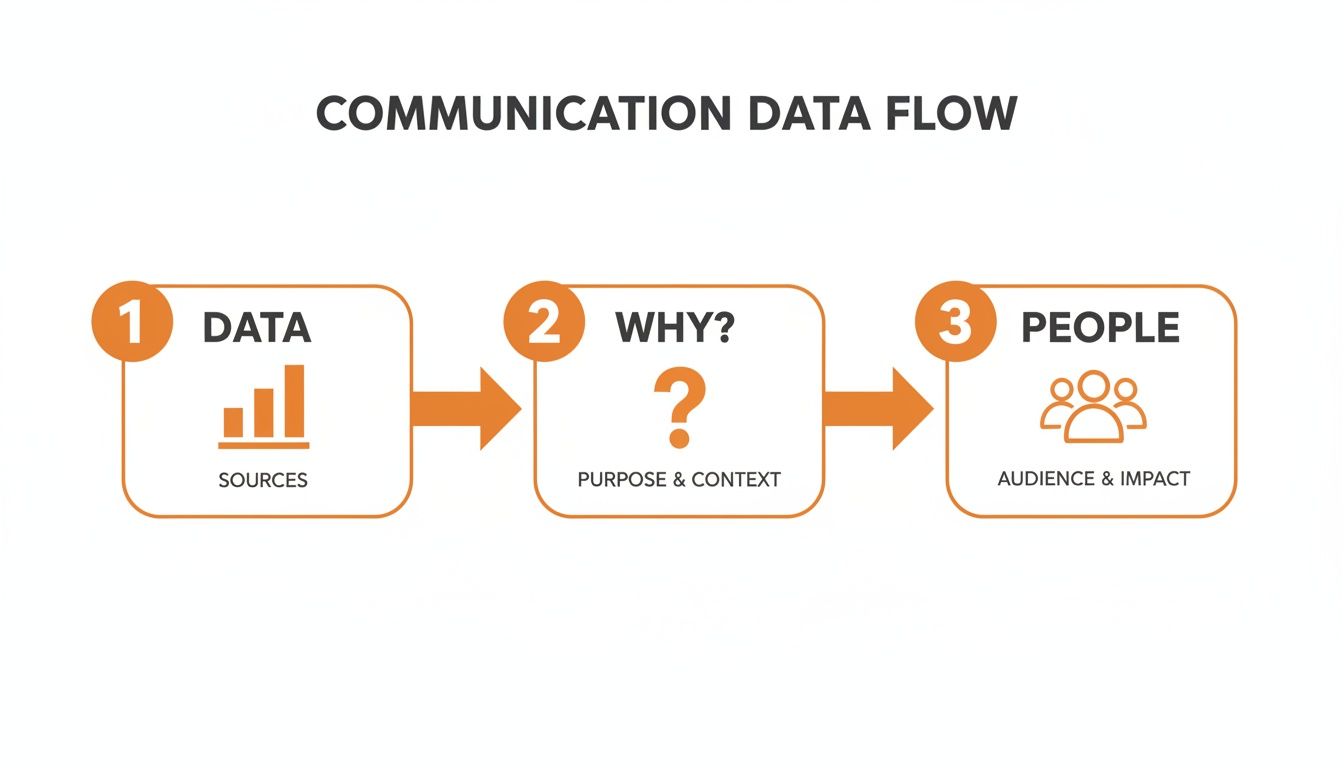
Using Quantitative Data to See What's Happening
Alright, you’ve nailed down your "why." Now it's time to get practical and figure out if your message actually landed. This is where quantitative data comes in, but let’s be clear: this isn't about chasing numbers. It’s about understanding what your team is actually doing.
Numbers tell a story about the what and the when. They show you who saw the message, who opened it, and who bothered to take the next step. Without this data, you're flying blind.
Beyond Vanity Metrics
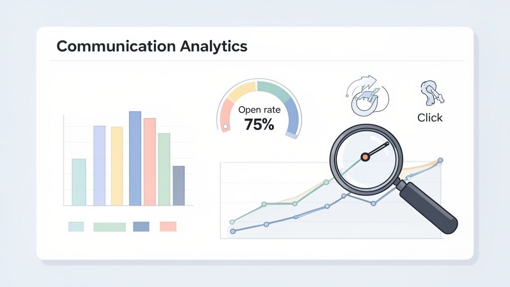
Think about the analytics you get from a platform like Pebb. You can see things like open rates, click-throughs, and even read receipts. It’s tempting to write these off as "vanity metrics," but that's a huge mistake. When you connect them back to your original goal, they suddenly become powerful signals.
A 75% open rate on a critical schedule update isn't just a number to brag about. It’s confirmation that three-quarters of your team has the information they need to show up on time tomorrow. That has a direct, tangible impact on your operations.
On the flip side, a dismal click-through rate on a link to enroll in new benefits is a big red flag. Maybe the message was confusing, the subject line was a snooze, or the timing was just all wrong. The number itself doesn't hand you the answer, but it points you exactly where you need to start digging.
The Metrics That Truly Matter
Let’s be honest, you could track dozens of different things. But you're busy, and you only need the handful of numbers that tell you if you're on the right track. This table breaks down the essentials we always focus on. These are the metrics that cut through the noise and give you a real picture of your communication health.
Metric | What It Measures | Why It Matters |
|---|---|---|
Reach & Open Rates | The percentage of your audience who received and opened your message. | This is your baseline. A low reach means your channels are wrong; a low open rate suggests your headlines aren't grabbing attention. |
Click-Through Rate (CTR) | The percentage of people who clicked a link within your message. | This is all about action. A strong CTR shows your message was compelling enough to inspire the next step, like reading a new policy. |
Completion Rate | How many people completed a required action (e.g., watched a full video). | For training or compliance, this is critical. It tells you if the core content was actually consumed, not just skimmed. |
Acknowledgment Rate | The percentage of employees who confirmed they received and understood a message. | This is non-negotiable for critical updates. Knowing 98% of your team acknowledged a policy change gives you confidence to move forward. |
Engagement Over Time | When your audience is most likely to open, click, and interact. | This helps you optimize your timing. If messages sent Tuesday at 2 PM always win, you've found your team's sweet spot. |
These metrics aren't just data points. They are clues to human behavior. They tell you what’s working, what’s falling flat, and when your team is actually listening.
Building a Simple, Actionable Dashboard
Your goal isn't to build some monstrous spreadsheet that nobody ever looks at. The point is to create a simple, at-a-glance view of your communication health that can answer basic questions instantly.
Start by tracking your chosen metrics week over week. You’re looking for patterns, not just isolated events. A single email with a low open rate might just be a fluke. But a four-week trend of declining open rates? That’s a problem you need to solve. To get a better handle on the spread and central tendency of your data, you could even use a box and whisker plot maker.
The whole point of tracking this stuff is to make better decisions. If you see that short video messages get three times the engagement of your text-only posts, the action is simple: make more videos. If you notice a specific department has consistently low read rates, it’s probably time to have a chat with their manager. We actually dig much deeper into this in our article about the metrics for measuring communication change.
Quantitative data gives you the map. It shows you the roadblocks and the open highways. But it only tells you what is happening. To understand why, we need to bring in the human element.
Using Qualitative Data to Understand Why
Numbers tell you what’s happening. But where they fall short, and where most communication plans fail, is in explaining why.
A high open rate on a new policy announcement doesn't tell you if your team felt anxious, confused, or confident about the change. A low click-through on a benefits update doesn't explain if the timing was bad or if the message itself eroded trust. This is the point where we have to stop counting and start listening.
Qualitative measurement is the art of gathering the human side of the story. It’s how you uncover the narrative behind the statistics—the difference between seeing a fever on a thermometer and understanding what’s causing the illness. Without it, you're flying blind with only half the data.
The Power of the Simple Question
Let's be real: the term "qualitative data" can sound academic. It doesn't have to be. In my experience, the most powerful insights come from simply asking a direct question at the right moment.
Imagine you’ve just rolled out a major shift in company strategy. Your analytics show a 90% read rate, which looks fantastic. But what’s the actual mood in the building? Is the team buzzing with excitement or paralyzed by fear?
This is the perfect spot for a quick pulse survey. I'm not talking about a 20-question beast. I mean two or three carefully chosen questions sent straight to their phones. Something as simple as, "On a scale of 1-5, how clear is the new strategy to you?" followed by an open-ended, "What’s one thing that excites or concerns you about this new direction?"
The answers you get back are pure gold. They'll reveal the anxieties your analytics could never see, pinpoint widespread misunderstandings, and maybe even uncover a brilliant idea from someone on the front lines. This is the kind of feedback that lets you get ahead of problems before they fester.
Quantitative data shows you the smoke. Qualitative feedback helps you find the fire.
Crafting Questions That Invite Honesty
The quality of the feedback you get is a direct reflection of the quality of your questions. Bad questions lead to vague, useless answers. Good questions can open the floodgates to candid, game-changing insights.
The secret is to drop the corporate-speak and avoid leading the witness. Don't ask something like, "How can we better communicate our synergistic strategic initiatives?" You’ll just get blank stares.
Instead, talk like a human being.
Bad Question: "Do you have any feedback on the new workflow optimization?"
Good Question: "What’s one thing about the new workflow that feels clunky or slows you down?"
See the difference? The second question is specific, personal, and gives people permission to be critical. It invites a real story, not just a "yes" or "no." Your goal is to make it easy and safe for people to tell you the truth. For a deeper dive on this, check out our ultimate guide to employee feedback strategies, which is all about building a culture of open dialogue.
Finding the Patterns in the Noise
Once the feedback starts rolling in—from surveys, one-on-ones, or team huddles—your job is to become a pattern-finder. You aren’t here to analyze every single word; you're on a mission to spot the recurring themes.
Don't get bogged down trying to turn every comment into a number. Just read through the responses and start grouping them. You might see a cluster of comments around "not enough notice" or "the instructions were confusing." These themes become your roadmap for what to do next.
Let's say a dozen people all mention that they didn't understand a specific part of a recent announcement. That’s a signal you can't ignore. It’s far more powerful than a 70% open rate because it tells you exactly what to fix. Your next move isn’t just resending the same email; it’s creating a targeted follow-up—maybe a short explainer video or a quick FAQ—that directly addresses the point of confusion.
This is how you truly measure effectiveness. You take the "what" from your data, combine it with the "why" from your people, and use that complete picture to get better every single time. It's not about being perfect; it's about being willing to listen and adjust.
Creating a Simple Feedback Loop
Collecting data is only half the battle. Let’s be honest, the real work begins after the numbers are in. An insights dashboard that nobody acts on is just noise. Your goal isn't to create another report; it's to start a conversation that leads to meaningful improvement.
This is all about creating a simple, powerful feedback loop. You measure what’s happening, you figure out why it's happening, you act on that insight, and then you measure again to see if your change worked. It's a continuous cycle of listening and responding.
This simple process is how you connect raw data to the human story and then to concrete action.
From Insight to Action: A Real-World Example
Let’s walk through a scenario we see all the time. Imagine you're looking at your analytics and you spot a clear pattern: messages sent on Monday mornings have terrible engagement. The open rates are low, and acknowledgment rates are even worse.
Your quantitative data just told you what is happening. Now you need to find out why.
You send out a quick, two-question pulse survey: “On a scale of 1-5, how overwhelming is your Monday morning?” followed by, “What’s the first thing on your mind when you start the week?” The qualitative feedback pours in, and a clear theme emerges. Your team is swamped—they're digging out from weekend emails and prepping for their weekly huddles. Your "critical update" isn't critical to them in that moment; it’s just more noise.
The insight is crystal clear: Monday morning is the wrong time.
So, you act. You shift your weekly updates to Tuesday afternoons. Then comes the most important step: you measure again. A few weeks later, you check the numbers and see open rates have jumped 40%. You’ve just closed the loop.
Sharing Findings That Get People to Act
Just finding an insight isn’t enough; you have to get leadership on board. The trick is to present your findings not as a communication problem, but as a business solution.
Don't just walk into a meeting and say, "Our open rates are low on Mondays." Honestly, no one cares.
Instead, frame it around the business outcome.
“I’ve noticed we’re getting low engagement on our Monday safety briefings, which puts us at risk. The team says they’re too busy with opening duties to absorb it. By moving the briefing to Tuesday afternoon, we can increase comprehension and ensure everyone has seen the latest protocols.”
See the difference? You’ve connected the data (low engagement) to the human reason (overwhelmed team) and tied it directly to a business risk (safety compliance). You’re not just presenting a problem; you’re offering a smart, data-backed solution. This is how you turn engagement data into action and show your real value.
Proving You’re Actually Listening
Finally, closing the feedback loop is the single best way to build trust. When employees take the time to give you feedback, and they see a direct, positive change as a result, something powerful happens. They learn that their voice actually matters.
It’s crucial to communicate the "why" behind your changes back to the team. A simple message like, "Hey everyone, we heard your feedback about Monday mornings being hectic. Moving forward, our weekly updates will come out on Tuesdays to give you more time to settle in," does two things. It validates their input and shows you respect their time.
This isn’t about one-time fixes. It’s about building a culture where communication is a two-way street. That’s how you move from just talking at your team to truly communicating with them.
Common Questions About Measuring Communication
We’ve covered a lot of ground, but let's be real—digging into measurement can feel like opening a can of worms. You solve one problem and three new questions pop up. Honestly, that’s a good thing. It shows you're thinking hard about what will actually move the needle for your team.
After years of helping leaders with this, a few questions come up again and again. So, let’s get right to it.
How Often Should We Measure Communication Effectiveness?
There’s no magic number. Measuring everything constantly is a fast track to burnout. On the other hand, a once-a-year check-in is like trying to understand a movie by looking at a single photo.
The best rhythm matches the measurement to the communication itself.
Quantitative data like open rates and clicks are best tracked weekly. This gives you a great pulse on short-term trends without drowning you in daily noise.
Qualitative feedback, like pulse surveys, is perfect for a quarterly cadence. This gives you a regular checkpoint on team sentiment without causing survey fatigue.
For big initiatives—like a major policy change—you'll want to measure before, during, and after. This gives you a solid baseline, a chance to course-correct, and a clear picture of the final impact.
What Is the Most Important Metric to Track?
This is a bit of a trick question. The "most important" metric is whichever one is most tightly connected to the business outcome you're trying to achieve. It’s that simple.
If your big goal is to improve workplace safety, then quiz scores on new safety training are your north star. If you’re trying to lift morale after a tough quarter, the sentiment score from an anonymous pulse survey is what you should be watching.
The best metric is never a vanity number like views or likes. It’s the one that proves you’ve created a real shift in understanding, behavior, or belief that helps the business.
Always tie it back to your "why." Focus on the signal, not the static.
How Do We Get Honest Feedback from Our Team?
Getting people to share what they really think boils down to one simple word: trust. And building that trust rests on two non-negotiable pillars: anonymity and action.
First, you have to create psychological safety. Using a tool that guarantees anonymous feedback isn’t just a nice-to-have; it's essential. You need to be loud and clear that all feedback is confidential and there will be zero repercussions. People need to believe it.
Second—and this is where most companies fall flat—you must visibly act on the feedback. When your team sees that their comments, even the tough ones, lead to actual change, they start to believe in the process. It doesn't have to be monumental; it could be as simple as clarifying a confusing policy or shifting a weekly meeting time that wasn't working.
Always close the loop. Share a quick summary of what you learned and—this is the most important part—what you’re going to do about it. That's the only way to prove you’re truly listening.
At Pebb, we built a platform to make this entire process less of a headache. With unified communication, built-in analytics, and pulse surveys all in one place, you can stop guessing and start knowing. See how Pebb can help you build a culture of clarity and trust.
