
Employee Engagement Dashboard: A Practical Guide for Leaders
Learn how an employee engagement dashboard turns signals into action. Discover key metrics, real visualizations, and a rollout plan HR and ops leaders can
Dan Robin

The executive review is tomorrow. Your employee engagement dashboard is open, the tiles are green, and everyone expects a quick conversation about progress. Then a frontline supervisor mentions that overnight staff haven't seen the latest pulse survey, a manager says two strong employees are job hunting, and the room goes quiet.
That's the problem with treating engagement as one score. A dashboard can look healthy while missing the people least able to respond, the teams absorbing a sudden workload increase, and the employees who haven't resigned yet but no longer expect to stay. Gallup reports that global engagement remained below 25% for more than a decade, with 20% of employees worldwide engaged in 2025 and 31% of U.S. employees engaged at work in 2025. Gallup also estimated that low engagement cost the global economy about $10 trillion in 2025, roughly 9% of global GDP. Gallup's employee engagement data makes the management case plainly. The dashboard needs to do more than display sentiment. It needs to show where attention is required, who is missing from the signal, and what leaders should do next.
The Dashboard That Looked Healthy but Wasn't
The HR leader entered the executive review with every tile green. Participation stood at 84%, the composite engagement score had risen two points year over year, and the meeting ended early.
Six weeks later, voluntary attrition in the support function had doubled. Exit interviews repeatedly identified manager overload, while the dashboard still showed a healthy organization.
The failure sat in the measurement design. Participation appeared as one volume measure, and engagement appeared as a smooth organization-wide average. A high response rate can exclude a night shift. A composite score can rise while one manager's team loses trust. A quarterly snapshot can miss the week when a reorganization, schedule change, or promotion decision changes how employees feel about staying.
A green dashboard isn't proof that people are healthy. It's proof that the selected measures are green.
Self-reported sentiment remains useful, but it rarely moves evenly. Employees may continue answering positively while waiting for a manager problem to improve. Others may stop responding, leaving their experience absent from the results. By the time voluntary turnover confirms the issue, the most mobile employees may already be gone.
Across dashboard rollouts, I've seen the same gap in different forms. The screen can calculate its measures correctly and still hide the workforce segments leaders need to understand. Track participation quality, listening-channel reach, and intent-to-stay beside eNPS, pulse results, turnover, and absenteeism. That combination gives frontline and deskless workers a fair chance to appear in the picture, rather than allowing a broad average to speak for them.
A practical starting point is this guide to measuring employee engagement. The framework must go beyond a list of survey questions. It should show whether the right people were heard, whether their answers contained enough detail to interpret, and whether stated attachment matches operational behavior.
People analytics teams apply the same discipline in adjacent work, including AI screening for hiring outcomes. Collecting more data is not the objective. The objective is to expose the decision hidden inside the data, then make the missing voices and emerging retention risks visible.
What an Employee Engagement Dashboard Does
An employee engagement dashboard gives leaders a decision-ready view of listening data and workforce behavior. It brings together survey inputs with turnover, absenteeism, retention, tenure, response trends, and other operating measures, then organizes the relationships by team, location, manager, or tenure band. Guidance on HR employee engagement dashboards reflects this practical use. The goal is to spot movement while there is still time to respond, before attrition makes the problem obvious.
A survey report records a moment. It summarizes answers and may provide a benchmark, but it rarely shows how sentiment connects with participation or workforce behavior over time.
A full people analytics platform covers a much wider set of work, including compensation, hiring, learning, headcount planning, performance, and workforce forecasting. The engagement dashboard is narrower in scope, which helps a team make a decision without searching through every people dataset.
A simple operating model
I use a thermostat analogy because it keeps the operating model clear. A thermostat reads several zones and shows which areas are drifting out of range. An engagement dashboard should bring the same discipline to employee listening, especially where frontline and deskless workers may be missed by a single enterprise score.
It needs four input groups:
Sentiment inputs, including eNPS, pulse questions, and theme-level scores.
Participation measures, covering reach, completion, response distribution, and recency.
Behavior signals, such as voluntary turnover, absenteeism, retention, and internal mobility.
Intent-to-stay proxies, showing whether employees expect to remain, grow, or look elsewhere.
The dashboard should make listening-channel reach and participation quality visible beside sentiment. That prevents a polished average from hiding teams that were rarely invited, rarely able to respond, or consistently absent from the results.
Tools present these layers in different ways. If you are comparing formats, explore LeaveWizard's dashboard examples for a practical view of how workforce data can be arranged.
Every tile needs an owner and an action trigger. “Pulse score declined” is an observation. “If the score drops in a team while participation remains healthy, the HR business partner reviews manager workload with the team lead” is an operating rule. The dashboard earns its place when someone knows what to do after reading it.
The Four Signals Worth Tracking Together
A dashboard can show a healthy average while a frontline team is already struggling. Track eNPS, pulse results, voluntary turnover, and absenteeism together, because each signal captures a different part of the employee experience. Used as a set, they provide a more current view than an annual survey alone, as guidance on engagement measures makes clear.
eNPS measures broad attachment and advocacy. It shows whether employees would recommend the organization as a place to work. That makes it useful for tracking overall relationship strength, but it can miss a recent conflict between a manager and a team. If eNPS stays stable while pulse comments turn sharply frustrated, investigate the local pattern before accepting the enterprise average.
Pulse surveys capture short-cycle reactions to changes such as a scheduling policy, tool rollout, or reorganization. They can show a shift in mood before employees decide to leave. Keep core questions consistent so the trend remains interpretable, then use open-text responses to identify what changed.
Voluntary turnover connects perception to an observable outcome. Low eNPS with no movement in resignations may indicate a contained concern rather than a broader flight pattern. Rising eNPS alongside increasing voluntary exits needs scrutiny, especially when departures cluster among experienced or high-performing employees.
Absenteeism provides a useful stress signal for shift-based and deskless teams, which surveys may reach unevenly. A rise in unplanned absence does not prove disengagement. It does justify reviewing workload, scheduling, safety, and manager support. Read the pattern by location, shift, and team before drawing a conclusion.
Use the four signals to test one another, not to produce a single blended score. A strong pulse result with weak participation is incomplete. Stable sentiment alongside rising absence calls for operational review. High engagement among desk-based employees should not conceal missing responses from frontline workers.
Four engagement signals compared
Signal | What It Catches | Where It Lags | How to Read It |
|---|---|---|---|
eNPS | Broad attachment and advocacy | Local conflicts and sudden changes | Compare the trend and segment results |
Pulse results | Short-cycle mood and reactions | Employees who aren't reached or don't respond | Pair scores with comments and participation |
Voluntary turnover | Actual resignation behavior | The warning period before people leave | Examine team, tenure, and role patterns |
Absenteeism | Stress and operational strain | Causes unrelated to engagement | Review by shift, location, and manager |
Keep the signals on one screen, while preserving their separate meanings. Segment each by team, tenure band, and location. An enterprise average smooths away the pattern a manager needs to act on.
Why Participation Quality Belongs on the Dashboard
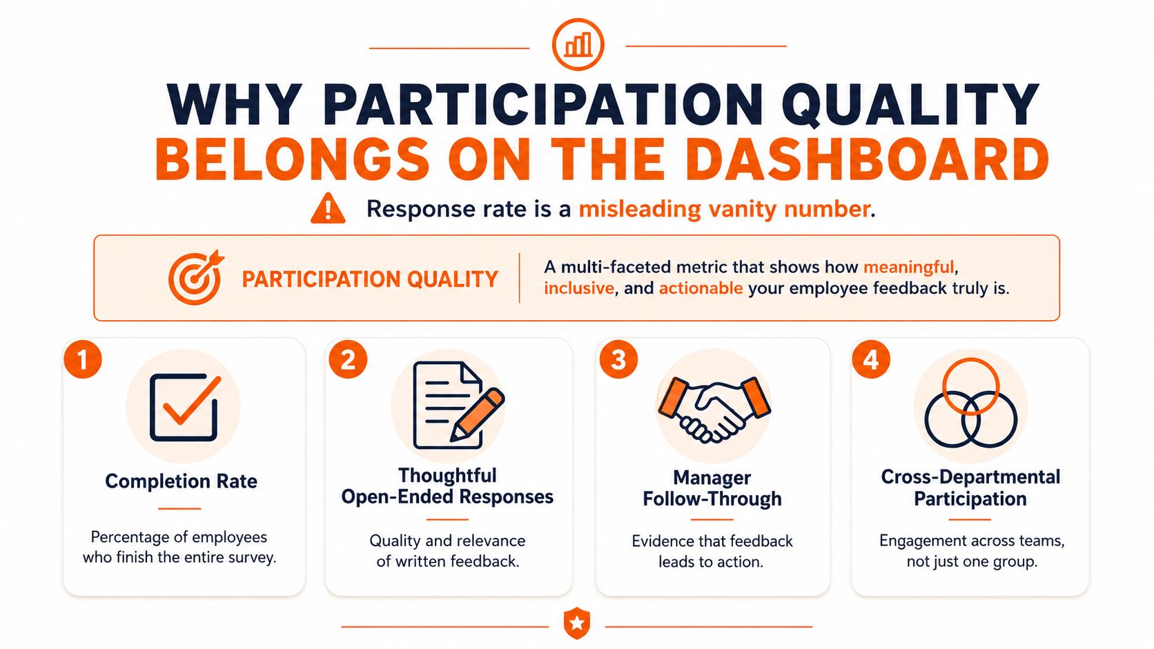
Response rate is necessary, but it isn't enough. A dashboard that reports only the share of employees who answered can create false confidence because it says nothing about who responded, how they responded, or when they responded.
I define participation quality through three questions. Did responses represent different roles, tenure groups, locations, and shift patterns? Did employees complete the survey thoughtfully, including the open-text portions? Are the answers recent enough to explain the current operating environment?
A warehouse can report a strong overall response rate while overnight pickers barely appear in the dataset. The headline looks healthy, but the dashboard may be describing the day shift. A contact center can show weaker overall participation and still produce useful sub-team cuts if responses are distributed consistently across the groups being compared.
Build a participation scorecard
A practical scorecard should show:
Reach, which employees had access to the listening channel.
Representation, whether responses cover roles, sites, tenure bands, and shifts.
Completion depth, whether people finished the instrument rather than abandoning it early.
Comment quality, whether written feedback contains enough detail to guide action.
Recency, whether the signal reflects the period leaders are managing now.
Follow-through, whether teams can see what happened after they shared feedback.
The published guidance that treats response rate below 50% as difficult to interpret is a useful warning, but even a higher rate can mislead if coverage is uneven. ContactMonkey's guidance on measuring employee engagement supports putting response health inside the dashboard, not burying it in a footnote.
Frontline employees often face structural barriers to participation. They may not have a company email address, a desk, a predictable break, or access to the same internal channels as office staff. A good dashboard makes that absence visible. It doesn't label missing data as apathy.
Visualizations That Change Decisions
A dashboard earns its space when a leader can see what changed, where it changed, and what action follows. Four visualizations cover different decisions, including trend interpretation, local diagnosis, external context, and listening access. Together, they keep participation quality, channel reach, and intent-to-stay signals visible beside the engagement score.
The trend line with annotated events
Use a trend line when leaders need to understand drift. Mark reorganizations, hiring freezes, compensation changes, policy rollouts, or manager transitions so the review has an operating context. A monthly pulse trend needs enough history to establish a meaningful baseline instead of putting too much weight on one noisy result.
During a rollout, this chart can prompt a review of a policy change when engagement begins shifting soon afterward. Its main failure mode is false causation. Two lines moving together do not prove that one caused the other. For a fast discussion, a simple before-and-after view may be clearer than a crowded event timeline.
The team and tenure heatmap
A heatmap works well in matrixed organizations and shift-based operations. It can reveal a stable company-wide score while newer employees at one location and experienced employees under one manager move in opposite directions.
Use it to focus a manager conversation on a local pattern rather than launch a broad culture campaign. Small groups create privacy and interpretation risks, so suppress or combine segments when the sample is too thin. For a small organization, a ranked table with context may communicate the pattern more clearly.
The benchmark bar
Benchmark bars give executives a reference point for comparing internal teams with industry or peer groups. Raw scores are difficult to interpret without external context. Qualtrics documents benchmark views that can be segmented by country, region, industry, company size, age, tenure, gender, and employment type through its benchmark editor documentation.
The key decision is target setting. The risk is gaming. Teams may chase a benchmark without understanding the local question, while small samples can make a comparison look more precise than it is. Use the bar for context, alongside participation coverage and intent-to-stay movement, rather than as a verdict.
The participation funnel
The funnel shows reach, access, partial completion, and full completion. It answers the question many reports omit: where did employees leave the listening process?
That view can prompt a practical fix, such as providing shared devices, changing survey timing, translating questions, or giving shift teams paid time to respond. It does not explain why people stopped. For a small pulse, a straightforward count paired with a comment theme may be enough.
Visualization | Key Decision It Supports | Watch Out For |
|---|---|---|
Trend line | Whether an event changed engagement direction | Mistaking correlation for causation |
Team and tenure heatmap | Which local group needs attention | Thin samples and privacy risks |
Benchmark bar | How to frame internal results against peers | Benchmark gaming and weak comparability |
Participation funnel | Where listening access or completion breaks | It shows the drop-off, not the reason |
Start with one trend line, one heatmap, one benchmark bar, and one funnel. More charts will not compensate for weak ownership. Keep frontline and deskless coverage visible in every review, because a polished engagement score can still hide who had no practical way to respond.
Rolling Out a Dashboard Without Overbuilding It
Most dashboard projects fail in one of two ways. The team tries to include every workforce metric and never ships, or it launches a polished screen that nobody uses because no meeting, owner, or decision is attached to it.
I prefer a small rollout with a hard operating rhythm.
Start with one relationship
Pick one signal, usually eNPS or a pulse composite, and connect it to one operational metric it should influence. Regrettable attrition in the same team is a reasonable example. The point is to test whether the dashboard helps leaders investigate and act, not whether it can display every available field.
Put the review on the calendar
Set the cadence before the dashboard goes live:
Weekly, review pulse anomalies and urgent participation gaps.
Monthly, examine trends and segment movement.
Quarterly, discuss strategic patterns, benchmarks, and resource decisions.
A name should sit beside every action. Without that, the dashboard becomes an HR artifact rather than a management tool.
Pilot with people who will challenge it
Choose two or three teams with managers willing to act on the data, not merely teams with polished reporting habits. The best pilot groups have low tolerance for dashboards that don't change decisions. Their objections will expose missing segments, confusing definitions, and metrics nobody can influence.
After one full cycle of action-informed review, add participation health and then intent-to-stay. That order keeps the build focused while addressing the blind spots that matter most for frontline teams. A realistic target is a working dashboard in 60 to 90 days, not a perfect one in a year. The rollout timing and dependency questions in this implementation timeline guide are useful when you need to turn the plan into calendar commitments.
Choose the tool that fits the work
Approach | Data Freshness | Segment Depth | Integration Cost | Frontline Access |
|---|---|---|---|---|
Native HRIS | Usually tied to system refreshes | Often limited to standard fields | Lower when data already lives there | Depends on employee access |
Point solution | Often strong for surveys and pulses | Usually strong within engagement data | Moderate, depending on connectors | Varies by mobile and shared-device support |
People analytics platform | Can combine many workforce sources | Typically broad and configurable | Higher implementation effort | Depends on deployment and permissions |
A hands-on workshop such as United We Transform exercises can help stakeholders work from their own dashboard ideas before the build becomes too abstract. Keep the first version boring. Boring gets reviewed.
From Static Scores to Continuous Listening
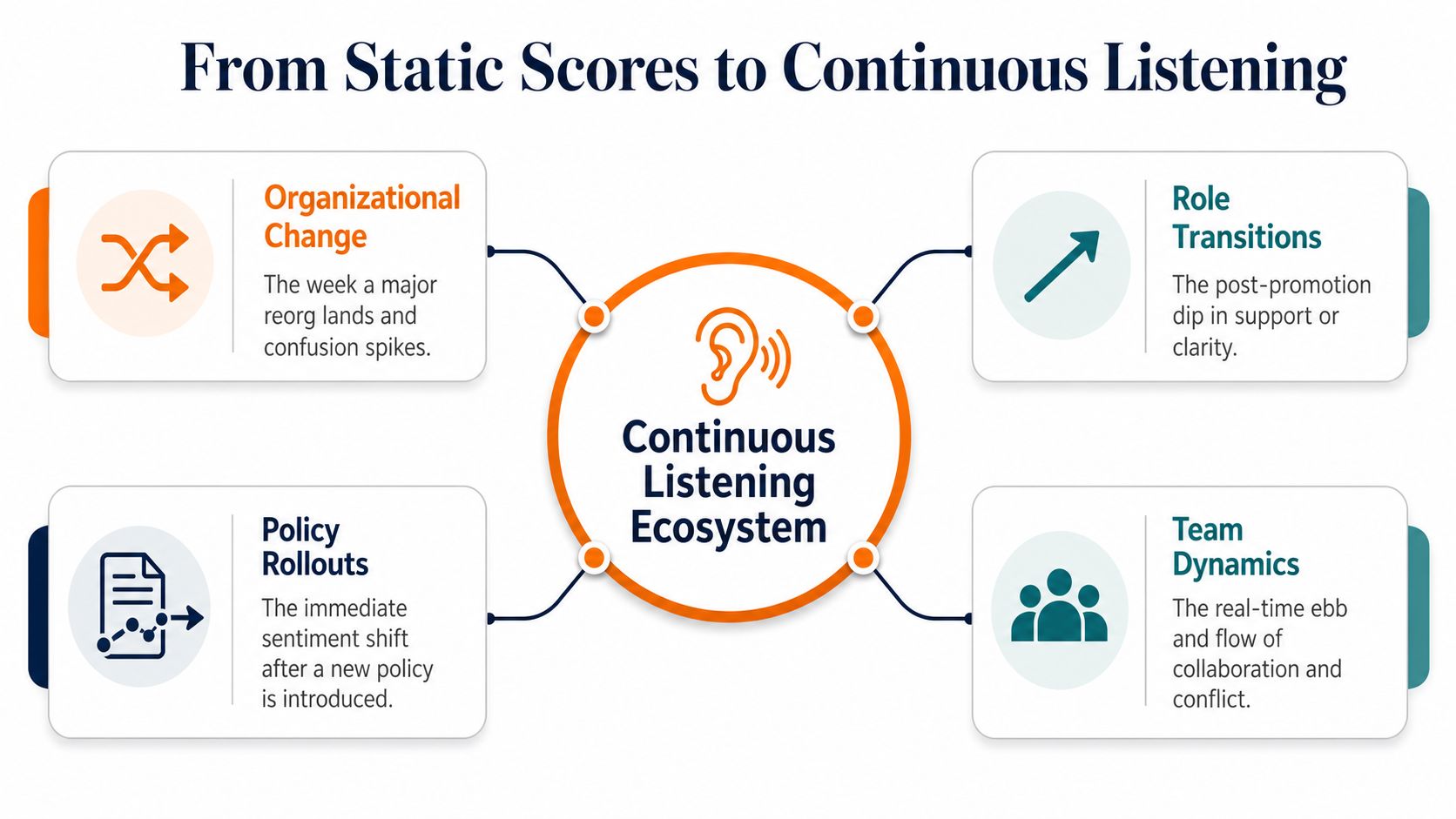
An annual survey can tell you what employees experienced across a broad period. It can't reliably show the week a reorganization lands, the post-promotion dip in clarity, or the immediate trust damage caused by a new policy.
Continuous listening doesn't mean asking employees questions every day. It means combining pulse surveys, open text, manager one-on-ones, and operational signals such as attrition and absenteeism. Each channel has a different role. Pulse data gives you a repeatable trend, open text adds explanation, one-on-ones provide local context, and operational measures show whether the experience is affecting behavior.
Add intent-to-stay
Intent-to-stay is the forward-looking layer many dashboards lack. eNPS tells you about attachment and recommendation. Turnover tells you who has already left. Intent-to-stay asks whether an employee expects to remain, grow, or search elsewhere before the resignation appears in the HRIS.
That makes it especially useful when paired with role, manager, tenure, and frontline status. A high-performing employee may still deliver strong work while privately planning an exit. A deskless employee may not leave a survey trail at all, but changes in attendance, schedule stability, manager contact, and stated intent can reveal that the relationship is weakening.
Perceptyx's 2026 employee engagement benchmark describes engagement as having flattened into a narrow year-over-year band after the volatility of 2020 and 2021, and reports that highly engaged employees were nearly twice as likely to say change is handled well. The practical implication is clear. Track change readiness and manager quality as operating signals, not as occasional discussion topics.
Set guardrails before increasing frequency
Ask only what someone can act on. Every recurring question needs a decision owner.
Protect confidentiality. Small teams need clear reporting rules and careful interpretation.
Show the response loop. Tell employees what changed because they gave feedback.
Watch channel reach. A mobile pulse doesn't automatically reach every shift or site.
Stop low-value questions. Survey fatigue grows when the dashboard never changes behavior.
Continuous listening without follow-through creates cynicism faster than an annual survey. The dashboard should help leaders act this week, then show employees that their input mattered.
Pebb gives teams one mobile and web space for communication, updates, chat, tasks, files, shifts, and PTO, with admin analytics that show activity by team, site, or department. If you want to connect listening-channel reach with the everyday communication patterns of frontline and office employees, visit Pebb and see how it can support a more complete employee engagement dashboard.
