

Author: Ron Daniel
The 3 Metrics That Actually Predict Employee Engagement
Explore the three essential metrics that predict employee engagement and drive business success in today's evolving workplace.
"Why does it feel like no one’s paying attention?" That’s what a manager at one of our partner companies asked me recently. Their team had just rolled out a shiny new engagement platform, but participation was dismal, and morale was slipping. Sound familiar? It’s a story I’ve heard too many times. Companies invest in tools, surveys, and dashboards, but they end up overwhelmed with data that doesn’t actually do anything. Meanwhile, the real issues - burnout, disconnect, and turnover - keep growing.
Here’s the thing: engagement isn’t just a feel-good metric; it’s a business priority. Disengaged employees cost U.S. companies a staggering $550 billion a year, and with hybrid work, labor shortages, and rising expectations for better workplaces, the stakes have never been higher. But here’s what I’ve learned at Pebb: not all metrics are created equal. The right ones don’t just measure the past - they predict what’s coming next.
In this article, I’ll break down the three metrics that actually matter - Employee Net Promoter Score (eNPS), Pulse Survey Scores, and Turnover/Retention Rates - and show you how to use them to build a workplace where people want to stay and thrive. Let’s dive in.
Understanding the 3 Key Metrics for Predicting Engagement
Let me tell you something we’ve learned at Pebb: not all engagement metrics are worth your time. Too often, companies get stuck chasing flashy numbers that look good in a report but don’t actually help you predict or solve problems. The key difference between a “nice-to-have” metric and a truly impactful one? Its ability to predict what’s next.
The metrics we focus on - Employee Net Promoter Score (eNPS), Pulse Survey Scores, and Turnover/Retention Rates - are more than just numbers on a dashboard. They act like an early warning system, giving us the insights we need to step in before small issues become big ones. Together, these three metrics paint a real-time picture of how engaged a team is, and trust me, engaged teams make a huge difference. For example, they boost profitability by 23% and cut turnover by 43% compared to disengaged teams. On the flip side, disengaged employees cost U.S. companies a staggering $550 billion a year. Clearly, this isn’t just a people problem - it’s a business problem.
Let’s break down what makes these metrics so effective.
What Makes a Metric Predictive?
Here’s the thing: not every data point you collect will actually help you make decisions. A predictive metric needs to check three boxes - it has to be measurable, actionable, and aligned with organizational goals.
Measurable: Vague feedback won’t cut it. You need clear, trackable numbers that show progress (or problems) over time. This also lets you compare data across teams and even benchmark against industry standards.
Actionable: A good metric doesn’t just tell you something’s wrong; it points you toward a solution. For instance, if your eNPS drops in the marketing team, you know exactly where to dig deeper and make changes.
Aligned with goals: Engagement isn’t just about keeping people happy - it’s about driving outcomes. Employees who feel heard are 4.6 times more likely to perform at their best. That’s the kind of engagement that moves the needle for your business.
Here’s an example of how this works in action: we partnered with a mid-sized tech company during a major organizational shift. They moved from annual reviews to biweekly feedback and started using pulse surveys to track employee sentiment. When the data revealed communication gaps, they quickly improved internal updates and transparency. The result? A 15% jump in eNPS and a noticeable drop in voluntary turnover within six months.
Metrics like these don’t just tell you where you are - they help you figure out where to go next.
The Role of Technology in Engagement Tracking
Let’s be honest: spreadsheets and manual surveys just don’t cut it anymore, especially for teams spread across different locations. That’s one of the reasons we built Pebb the way we did.
With technology, you can automate the hard stuff - like collecting, analyzing, and reporting data. Instead of waiting weeks to compile survey results, you get real-time dashboards, instant alerts, and trend analysis that help you spot issues before they snowball. This is a game-changer for companies with diverse teams. Imagine a retail chain with dozens of stores or a healthcare system with both office staff and frontline workers. Manual tracking would be a nightmare, but the right platform makes it seamless.
What I’ve found most effective is when engagement tracking feels invisible to employees. At Pebb, we integrate these workflows directly into the tools people already use, so there’s no need for extra logins or clunky interfaces. This approach not only boosts participation rates but also delivers more accurate data.
And let’s not forget about privacy. Employees need to trust that their feedback is safe and anonymous. That’s why we’ve built strong protections into Pebb - from secure data storage to clear communication about how their input will be used. Without trust, you won’t get honest feedback, and without honest feedback, the whole system falls apart.
When technology makes engagement tracking simple, intuitive, and secure, you can finally focus on what matters: spotting trends, addressing issues early, and taking meaningful action. That’s when these three metrics truly shine.
Metric 1: Employee Net Promoter Score (eNPS)
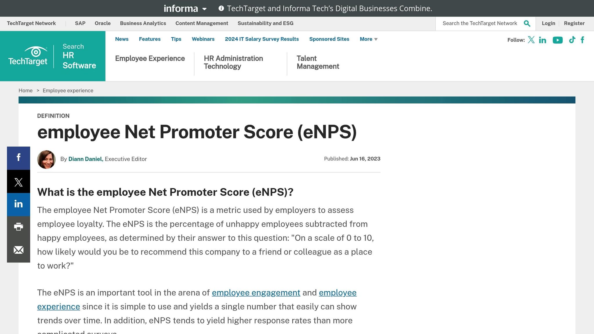
Employee Net Promoter Score, or eNPS, is one of those metrics that cuts straight to the chase. It’s simple, direct, and tells you exactly how your employees feel about working at your company. Think of it as the workplace equivalent of asking, “Would you recommend this restaurant to a friend?”
What eNPS Reveals About Employee Sentiment
eNPS doesn’t just measure satisfaction - it’s a window into future engagement. It works much like the customer version you’ve probably seen before, but here’s the twist: instead of asking customers about your product, you’re asking employees about their experience with your company. The key question? “On a scale of 0–10, how likely are you to recommend this organization as a place to work?”
Here’s how the responses break down:
Promoters (9–10): These are your workplace cheerleaders. They’re engaged, enthusiastic, and often the ones who’ll go the extra mile - and even bring in new talent through referrals.
Passives (7–8): They’re content but not overly excited. They’ll do their jobs, but don’t expect them to shout your praises from the rooftops.
Detractors (0–6): These folks are disengaged and may even share negative opinions about the company, potentially impacting morale and retention.
Promoters are your hidden gems - they’re less likely to leave and more likely to inspire others. On the flip side, detractors might already have one foot out the door.
How to Measure and Understand eNPS
The calculation is refreshingly simple. Subtract the percentage of detractors from the percentage of promoters, and voilà - you’ve got your eNPS. Passives are excluded from the equation. For example, if 40% of employees are promoters, 30% are passives, and 30% are detractors, your eNPS would be 10.
The scale ranges from –100 to +100, and while a positive score is a good sign, the real value lies in tracking trends over time. Breaking down the data can reveal hidden patterns. For instance, maybe the marketing team scores sky-high while the operations team struggles. That’s your roadmap for where to focus.
Timing matters, too. Quarterly surveys often hit the sweet spot - frequent enough to catch trends but not so often that they feel intrusive. During major transitions, like a company restructuring, some teams even opt for monthly pulse checks to stay ahead of potential issues.
How Pebb Makes eNPS Tracking Simple
Here’s where Pebb steps in and makes life easier. We’ve taken the hassle out of team communication and operations by weaving them directly into the tools your team already uses. No more clunky survey links or emails that get buried in inboxes. With Pebb, eNPS surveys pop up naturally within your team’s everyday workflow. Employees can respond with a single click, which means participation rates skyrocket compared to traditional methods.
But we didn’t stop there. Our all-in-one employee app brings your team’s communication and operations into one actionable hub. Want to see how one team’s score has changed over the past six months? Done. Curious if a recent engagement initiative boosted morale? The dashboard connects the dots for you. You can even drill down by department, location, or tenure to pinpoint exactly where you’re excelling - or where you need to step up.
The real-time analytics are a game changer. If a team’s score takes a dip, you’ll know immediately and can address the issue before it snowballs. On the flip side, when scores improve, you can celebrate those wins and figure out what’s working.
We’ve also added a range of features to make follow-ups seamless. For example, if someone leaves a low score, the system can nudge their manager to schedule a one-on-one chat. High scores? That’s your chance to recognize and learn from those employees’ experiences. All of this happens right within the Pebb platform - no jumping between tools.
And don’t worry about privacy. We’ve built in rock-solid safeguards to ensure individual feedback stays anonymous while still giving managers the insights they need to make meaningful changes.
Now, here’s the kicker: all of this starts with a free plan for up to 15 employees, with our Premium plan at just $4/user/month. That’s enterprise-level eNPS tracking, fully integrated into your communication platform, without the headache of juggling multiple tools. It’s engagement made easy - and effective.
Metric 2: Pulse Survey Scores
Think of eNPS as your quarterly check-up, while pulse surveys are your daily health tracker. These quick, targeted surveys are designed to capture the here and now of your workplace - a must-have tool for staying ahead of engagement roadblocks.
Why Frequent Feedback Matters
Pulse surveys are like the multitool of employee feedback. Forget those exhausting annual surveys no one looks forward to. Pulse surveys are short and sweet - just 5 to 10 questions that take under five minutes to complete. We’re talking about simple, direct questions like, “How supported do you feel by your manager this week?” or “Rate your current workload on a scale of 1 to 10.”
The real power of pulse surveys lies in their frequency. They don’t just tell you how things were a few months ago - they show you how things are right now. Imagine this: your team is riding high in January, but by March, a big project launch has everyone feeling swamped. A quarterly survey might miss that dip entirely, but a monthly pulse survey catches it in time to address the issue.
Here’s a stat that always sticks with me: employees who feel heard are 4.6 times more likely to feel empowered to do their best work. This isn’t about tossing up a suggestion box and hoping for the best. It’s about creating consistent, meaningful opportunities for your team to share what’s really going on. That’s where pulse surveys shine - they give you the insights you need to act quickly.
Crafting and Understanding Pulse Surveys
Creating a great pulse survey is a mix of strategy and simplicity. The golden rule? Keep it focused. Each survey should tackle one or two specific themes. Maybe this month you’re asking about work-life balance, and next month you’re diving into manager relationships.
The best surveys pair quantitative questions (like a 1-10 scale on workload satisfaction) with open-ended follow-ups. That way, you get the numbers to spot trends and the context to understand why those trends exist.
Timing is everything. Monthly surveys hit the sweet spot - frequent enough to catch changes but not so frequent that people tune them out. Weekly surveys, on the other hand, can lead to burnout, and once people stop responding, your data becomes useless.
The real magic happens when you dig into the data. Let’s say your overall engagement score looks fine. But when you break it down by department, you might find that your customer service team is struggling while your product team is thriving. That’s actionable insight you can use.
Here’s an example: a mid-sized tech company we work with started running monthly pulse surveys focused on communication and recognition. They noticed consistently low scores around manager feedback, so they rolled out targeted training for their leadership team. The result? A 15% boost in engagement scores over six months. The key was acting fast - they didn’t wait for the annual review to tackle the issue.
How Pebb Makes Pulse Surveys Effortless
At Pebb, we’ve taken team communication and operations and brought them together in one simple app. Once you set up your questions and choose how often you want them sent, we handle the rest. No more reminders or chasing down responses. The surveys pop up right where your team already works, keeping things seamless.
Our all-in-one employee app is where the magic happens. As soon as responses start rolling in, you can spot trends instantly. If stress levels spike after a product launch, you’ll know right away. If a new manager is struggling to connect with their team, the data will flag it before it snowballs into a bigger issue.
We’ve also built in smart collaboration tools. You can break down results by department, location, or even custom groups like remote vs. in-office employees. Want to compare how new hires are feeling compared to tenured team members? Done. It’s all there in one place.
But the real game-changer is how everything works together in one place. If someone reports feeling overwhelmed, their manager gets an automatic nudge to schedule a check-in. High engagement scores? That triggers a recognition workflow to celebrate the wins. And don’t worry - individual responses stay completely anonymous, so your team feels safe sharing their honest thoughts. It’s the perfect mix of transparency and trust.
Oh, and here’s the kicker: all of this comes with our Premium plan for just $4/user/month. You get enterprise-grade automation, real-time analytics, and integration with your favorite communication tools - all in one platform. No exporting data, no juggling multiple systems - everything you need is right where your team already spends their time.
When you pair pulse surveys with eNPS, you get a full picture of your workforce’s engagement. eNPS gives you the big-picture sentiment, while pulse surveys dig into the details, showing you what’s driving those feelings and how they’re shifting over time. Together, they’re like the ultimate toolkit for building a thriving, engaged team.
Metric 3: Turnover and Retention Rates
Think of eNPS as your engagement thermometer and pulse surveys as your daily health tracker, but when it comes to measuring the true impact of your employee engagement efforts, turnover and retention rates are where the rubber meets the road. These numbers tell the real story - whether your team feels connected enough to stick around or is quietly heading for the exit.
Why Retention Reflects Engagement
Retention rates are like a mirror reflecting your employees' engagement levels. While surveys can give you a snapshot of how people feel in the moment, retention paints a bigger picture. Engaged employees stay because they see growth, purpose, and value in their roles. Disengaged employees? They usually start mentally checking out long before they hand in their resignation.
Here’s the thing: companies with engaged teams consistently enjoy lower turnover rates. And that’s not just good for morale - it’s good for your wallet. Replacing an employee can be expensive, so even small improvements in retention can make a noticeable difference to your bottom line. Plus, retention serves as a lagging indicator. If your eNPS and pulse survey scores are climbing, but your retention isn’t budging, it’s a clear sign there’s a deeper issue at play.
How to Calculate and Analyze Retention Rates
Luckily, calculating retention rates is pretty straightforward: Retention rate = (remaining employees / starting employees) x 100. For instance, if you started the year with 100 employees and ended with 85, your annual retention rate is 85%.
But here’s where it gets interesting - breaking these numbers down by department or timeframe can uncover patterns you’d otherwise miss. Maybe your overall retention looks solid, but one team is struggling to keep people. That’s where the real insights lie.
It’s also worth looking at retention across different timeframes. For example:
Short-term retention: How many new hires stick around after 90 days? This can spotlight issues in your onboarding process.
Annual retention: A big-picture view of your entire workforce over the year.
Long-term trends: Are you seeing steady improvement, or is there a concerning dip?
And don’t forget to separate voluntary turnover (when employees leave for other opportunities) from involuntary turnover (like performance-related departures). Voluntary exits often reveal more about engagement challenges.
How Pebb Makes Retention Tracking Easy
Here’s where things get exciting - Pebb brings your team’s communication and operations together in one place. Our all-in-one employee app doesn’t just support daily work; it keeps everyone connected with chat, updates, tasks, forms, scheduling, and more in a complete view of your organization.
But we don’t stop at communication. Our tools help teams stay aligned across the day-to-day work that keeps operations moving. For example, if retention dips, Pebb might flag trends like declining manager satisfaction or engagement issues within a specific department. We’ve even built early warning systems that highlight behavioral changes - like employees skipping team events or disengaging from internal communications - so you can step in before it’s too late.
One of my favorite features? Tasks management. You can follow specific groups over time, like new hires from a particular quarter, employees who’ve been promoted, or teams that have undergone major changes. This helps you see how different experiences impact retention in the long run.
And when it comes to organizing daily work, Pebb’s tasks, calendar events, digital forms, and knowledge base are a game-changer. Want to compare retention between remote and in-office employees? Or see how it varies across managers or departments? It’s all there, ready to help you take immediate action - whether that’s scheduling one-on-ones with at-risk employees or giving a shout-out to high-performing teams.
With all these features packed into your existing communication hub for just $4/user/month, Pebb makes it easy to keep your retention strategy front and center. And because it’s seamlessly integrated, your data is always up-to-date and ready to help you make smarter decisions.
Bringing the Metrics Together: Driving Engagement with Data
When you combine key metrics, you unlock a complete view of employee engagement. This integrated approach doesn’t just show you what’s happening - it helps you understand why it’s happening and what to do next. It’s like having a detailed map to guide your engagement strategy, ensuring every step you take drives meaningful change.
Building a Holistic Engagement Strategy
Let me break it down: think of eNPS, pulse surveys, and retention rates as the three pillars holding up your engagement strategy. Each one tells a unique part of the story:
eNPS measures how likely employees are to recommend your company. It’s your high-level gauge of sentiment.
Pulse surveys act as your early warning system, catching potential issues before they snowball.
Retention rates reveal if your efforts are actually keeping top talent around.
Now, here’s where it gets powerful - when you start connecting the dots between these metrics. For instance, if your eNPS is slipping and turnover is climbing, while pulse surveys highlight recurring frustrations, you’ve got a clear picture of what’s wrong and where to focus. Often, these patterns point to specific teams or managers. Addressing leadership challenges in those areas can make a world of difference.
The secret sauce? Keep the feedback loop alive. Continuously gather data, act on what you learn, share updates with your team, and track the results. Engagement isn’t a one-and-done effort - it’s an ongoing conversation.
Acting in Real Time with Real-Time Data
Here’s the thing: waiting for an annual survey to spot problems is like trying to steer a ship with yesterday’s weather report. Real-time data changes the game. It lets you catch issues early and act fast. Employees who feel heard are 4.6 times more likely to feel empowered to do their best work. That’s huge.
This is exactly why we built Pebb as an all-in-one employee app for communication and operations. It gives you instant visibility into your engagement metrics - eNPS, pulse surveys, and retention rates - all in one place. Let’s say retention starts dropping in a specific department. Our system doesn’t just flag the dip; it connects the dots to related trends in pulse surveys and eNPS scores. You’re not left guessing - you know what’s happening and can respond right away.
We’ve even added features like tasks management, calendar events, digital forms, clock in, and shift scheduling, so teams can stay aligned before small issues grow into bigger problems.
Why Pebb is the Right Fit
Here’s where Pebb stands out: we make it simple to collect, analyze, and act on your engagement data. And we designed it for everyone - whether you’re at a desk or on the frontline. Engagement isn’t just a corporate office issue; it’s everywhere.
Our pricing reflects that accessibility. At just $4 per user per month for the Premium plan - and a free Standard option for teams up to 15 employees - Pebb delivers powerful tools without breaking the bank. You get automated survey scheduling, real-time dashboards, cohort tracking, and actionable insights. It’s all integrated into the platform your team already uses for work chat, news feed, tasks, calendar events, digital forms, clock in, shift scheduling, and collaboration.
Everything flows together seamlessly. When an engagement issue pops up, you can tackle it on the same platform, without missing a beat.
Because let’s face it: the companies that truly thrive aren’t just tracking the right metrics - they’re the ones turning those insights into immediate, meaningful action. That’s what sets Pebb apart. And that’s how you drive real engagement.
FAQs
How can companies turn eNPS and pulse survey results into meaningful actions instead of just collecting data?
To get the most out of eNPS and pulse surveys, it’s crucial to look beyond the surface. Instead of treating each result as a standalone piece of data, focus on spotting recurring themes and trends over time. This way, you can uncover the bigger picture and tackle the issues that matter most to your team.
One thing we’ve learned is that transparency goes a long way. By openly discussing the feedback with employees, you not only show that you’re listening but also pave the way for meaningful conversations. From there, it’s all about taking action - prioritize the areas your team highlights and make those changes happen.
Real-time insights are a game-changer here. They allow you to address urgent concerns quickly, preventing small problems from snowballing. And by keeping an eye on the results of your efforts, you create a cycle of continuous improvement. This isn’t just about fixing issues; it’s about building trust and creating a workplace where people feel valued and engaged. When that happens, productivity and morale naturally follow suit.
What are the most common mistakes companies make when analyzing turnover and retention rates, and how can they avoid them?
One thing I’ve noticed is how easy it is to fall into the trap of treating turnover and retention rates as standalone figures, without digging into the why behind them. Here’s the thing: high turnover isn’t always a red flag. Sometimes it’s just part of the industry norm, or it might even point to something positive - like transitioning out roles that no longer align with your company’s direction. But if you’re not asking the right questions, you might miss the bigger picture.
Another common slip-up? Skipping the deeper analysis. Issues like ineffective leadership, limited growth opportunities, or poor communication often sit at the heart of turnover problems, but they’re easy to overlook if you don’t dig deeper.
So, how do you avoid these missteps? Start by getting curious about the why. Use your data to uncover patterns - maybe it’s a particular department with higher turnover or a recurring issue with employee engagement. From there, you can zero in on solutions, like strengthening leadership training or creating clear pathways for career development. When you take the time to understand the root causes, you’re not just reducing turnover; you’re building a workplace where people actually want to stick around. That’s a win for morale and stability across the board.
How can tracking engagement metrics in daily workflows improve employee participation and data accuracy?
When engagement metrics become part of daily routines, it’s like hitting two birds with one stone. Employees can share feedback effortlessly while tackling their regular tasks, which naturally boosts participation. Plus, gathering input in real time means you’re capturing genuine thoughts, not filtered memories distorted by time.
Here’s where tools like Pebb shine. By weaving communication, collaboration, and feedback features into the platforms your team already uses, the whole process feels seamless. It’s not just about convenience - it’s about building a culture where transparency and trust thrive. When engagement tracking blends into everyday workflows, you get data you can actually rely on, paving the way for smarter decisions and a more connected team.
