
Template Newsletter Outlook
Stop fighting with Outlook. Learn how to create a professional, reusable template newsletter outlook that works on any device. Get your practical guide for
Dan Robin

The weekly internal newsletter usually starts with good intentions and ends with someone muttering at Outlook.
A manager drops in a last-minute announcement. Someone pastes text from Word. A banner image comes in too wide, so now the whole thing looks lopsided on mobile. You fix one spacing issue and create two more. By the time you hit send, the email looks different in desktop Outlook, Outlook on the web, and the phone in your pocket.
This is often accepted as normal. It shouldn't be.
Email is still one of the biggest communication channels we have. Designmodo's email benchmark roundup notes that daily emails sent worldwide are projected to reach 392.5 billion in 2026, and email delivers around $36 for every $1 spent. Internal comms isn't the same as customer marketing, but the lesson carries over. If a channel is that widespread and that measurable, the format deserves more respect than a cobbled-together message built from last week's leftovers.
The good news is you don't need a beautiful newsletter. You need a dependable one. A solid template newsletter in Outlook should save time, keep your formatting intact, and make it easy for someone else to take over without wrecking the layout. That's the bar. Not flashy. Just stable, readable, and repeatable.
That Dreaded Weekly Newsletter
The problem with most internal newsletters isn't the writing. It's the assembly.
I've seen perfectly decent company updates get buried inside broken layouts, mismatched fonts, and giant images that shove the message below the fold. People blame attention spans. Usually the template is the bigger problem. When the format feels chaotic, readers assume the content will be too.
Why this job keeps feeling harder than it should
Outlook was built for email, not for making polished recurring publications. You can force it to do the job, but forcing is the right word. That's why so many internal comms people end up rebuilding the same thing every week from scratch, even when they swear they have a template.
A newsletter people can scan in seconds will beat a “creative” one they have to decipher.
That matters more inside a company than many teams realize. Internal newsletters aren't just summaries. They're signals. They tell employees what matters this week, what changed, who joined, what shipped, and where to pay attention.
What a good internal newsletter actually needs
Not a great deal. It needs a few basic traits:
A predictable structure so readers know where to look first
Clean hierarchy so headlines, summaries, and links don't blur together
Reusable blocks so the sender isn't redesigning the thing every Monday
Enough restraint to survive Outlook's quirks
A lot of teams over-design because they're trying to make email feel exciting. That's usually the wrong fight. People don't need delight from a project update. They need clarity.
If you're working on a template newsletter Outlook setup right now, the best mindset is operational, not artistic. You're building a system that has to hold up under rushed edits, mixed skill levels, and weird rendering behavior. Once you treat it that way, the decisions get simpler.
The Two Paths for an Outlook Template
Organizations often choose between an old Outlook habit and a newer Microsoft direction. One is local and brittle. The other is lighter, simpler, and closer to where Microsoft is clearly heading.

The old-school file route
The classic option is the .oft file, the Outlook template file. It can be useful when one person owns the process on one machine. You save a prebuilt email, reopen it later, swap the content, and send.
That sounds fine until a team gets involved.
Local files create local chaos. Someone edits the “final” version but forgets to share it. Another person works from an older copy. A third person opens it and Outlook changes something subtle. Now your supposedly standard template exists in three versions and none of them match.
The lighter cloud route
The newer path is My Templates and related cloud-friendly methods. They're less flexible, but that trade-off is often worth it. You give up some bells and whistles in exchange for easier reuse, better consistency, and less dependence on one desktop setup.
For teams, that matters more than power. The perfect template that only one person can safely use isn't really a template. It's a trap.
A lot of internal comms leaders run into this exact problem when they first launch a recurring newsletter. If you're still deciding whether email is even the right recurring format, this guide on starting an internal company newsletter versus using a news feed is worth reading before you lock yourself into a workflow.
Where Microsoft is pushing things
Microsoft's own direction makes the decision clearer. Office 365 IT Pros reported that Microsoft announced Outlook Newsletters on 19 February 2025, with targeted-tenant preview in March 2025 and general availability scheduled for August 2025. It's built for internal newsletters only, and Microsoft says it can't be addressed to external recipients.
That limitation is useful. It tells you what this tool is for. Employee updates, team bulletins, internal announcements. Not customer campaigns.
Path | Best for | What breaks |
|---|---|---|
.oft files | One owner, stable desktop setup, simple reuse | Version control, sharing, team editing |
My Templates or built-in cloud methods | Team consistency, repeat use, easier maintenance | Less flexibility, fewer advanced controls |
Outlook Newsletters | Internal-only structured publishing in Microsoft 365 | Not suitable for external audiences |
Practical rule: Pick the method your least technical teammate can use without calling you for help.
That's usually the right answer.
Building Your Resilient Template Structure
If you want your Outlook newsletter to hold together, stop thinking like a web designer and start thinking like an email mechanic.
Modern layout tricks don't survive well in Outlook. Tables do.

Independent walkthroughs of the new Outlook editor point out that multi-column newsletters still rely heavily on HTML tables, and that spacing and border control are where most layouts go wrong. That's not glamorous advice, but it's the advice that saves you.
Start with one outer table
Build the whole email inside a single outer container table. Keep it simple. This acts as the frame for everything else. Then place nested tables inside it for each content area.
Think in modules, not pages.
Your basic modules might look like this:
Header block with title, date, and maybe a short intro
Lead story block with headline, summary, and link
Update block for smaller announcements
People block for welcome messages, promotions, or team wins
Footer block with contact details or where to get more help
If one module breaks, you want to fix one module, not rebuild the whole newsletter.
Keep formatting boring on purpose
A common pitfall for many is trying to “improve” the email with complex layout decisions that Outlook doesn't respect consistently.
Use basic inline styling. Keep fonts standard. Don't get clever with columns unless the information really needs them. In most internal newsletters, a strong single-column layout beats a fragile two-column one.
A few habits make a big difference:
Use white space generously so sections don't blur together
Limit each block to one main action so readers know what to click
Store images somewhere stable rather than relying on random attachments and copied screenshots
Write short section intros instead of giant slabs of text
Outlook rewards plain structure. It punishes ambition.
Build for repeat use, not one heroic send
Microsoft describes Outlook Newsletters as a way to create structured, professional email for updates, reports, and announcements, and its own guidance leans toward repeatable sections such as titles, header images, contents, and reusable sections rather than one-off message design in Microsoft's Outlook Newsletters support documentation.
That lines up with what works in practice. The strongest template newsletter Outlook setups aren't “designed” each time. They are assembled from parts that already know their job.
A useful working model looks like this:
Module | What belongs in it | What to avoid |
|---|---|---|
Header | Newsletter name, short intro, clear topic | Huge hero image, multiple competing messages |
Main update | One headline, short summary, one link | Long essay-style copy |
Secondary items | Small, scannable updates | Mixed formatting from pasted content |
Footer | Contact point, next-step info | Extra navigation clutter |
The trick is not making the template capable of everything. It's making it hard to misuse.
If your team can drag in a headline, summary, image, and link without damaging the layout, you've built something worth keeping.
Design and Accessibility Are Not Optional
A newsletter that looks fine to you but fails for other people is not finished.
That's the gap in most Outlook advice. It talks about layout and ignores the human part. Microsoft's formatting guidance for Outlook Newsletters covers structure such as titles, header images, contents, and sections, but it doesn't go deep on the accessibility habits internal comms teams need every week. That gap matters because many tutorials still treat alt text and accessible structure like optional cleanup rather than core workflow.
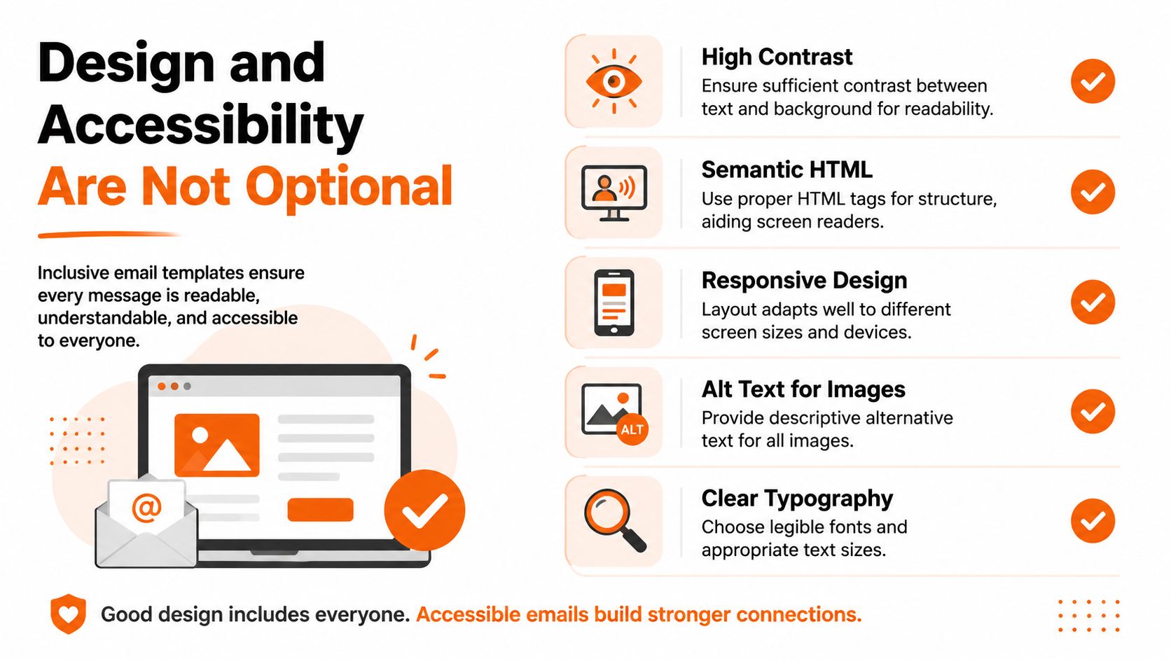
Accessibility starts in the template, not at the end
If you wait until the final review to think about accessibility, you'll miss things. The template itself should make good choices easier.
That means every meaningful image needs alt text. It means the reading order should make sense when images don't load or when a screen reader moves through the content. It means decorative clutter should be stripped back so the message isn't buried in noise.
If your team needs a practical companion to this mindset, this piece on making internal communication accessible is a useful follow-up.
A simple standard that most teams can keep
You don't need a giant compliance framework to improve things fast. You need a short checklist and the discipline to use it every time.
Use one clear column so the message reads cleanly on phones and narrow screens
Add alt text on purpose so images carry meaning even when they aren't seen
Choose readable type instead of tiny text that only works on a big monitor
Check contrast so dark text on light backgrounds, or the reverse, stays readable
Keep headings honest so each section says what it is, not something vague and clever
Good internal communication includes the colleague on a phone in a warehouse, the colleague using assistive tech, and the colleague skimming between meetings.
Respect beats decoration
This isn't about pleasing a policy team. It's about basic respect for coworkers.
A lot of internal newsletters fail because the sender assumes everyone reads email the same way they do, on the same screen, with the same eyesight, in the same environment. They don't. Some people are on mobile. Some are in dark mode. Some are relying on assistive tools. Some are just tired and scanning fast.
Design choices either remove friction or add it. In internal comms, that choice is moral before it's aesthetic.
How to Test and Use Your Template
Most newsletter problems aren't created when you build the template. They're created when you trust it too much.
One clean preview inside your own Outlook window proves almost nothing. You need to test the message where people will read it.
Run a small pre-flight check
Before every send, I recommend a short routine. Nothing elaborate. Just enough to catch the obvious breakage.
Send a test to yourself first. Check links, spacing, image loading, and whether the subject line matches the message.
Open it in more than one Outlook environment. Desktop, web, and mobile all matter because each one reveals different weaknesses.
Ask one or two colleagues to sanity-check it. Ideally, use people on different devices.
Look at dark mode. Some emails that seem fine in light mode become muddy fast.
Read it like an employee, not the sender. Can you tell what's important in a few seconds?
That last one matters most. Internal newsletters die when everything sounds equally urgent.
Use the template for recurring patterns
The easiest way to make a template useful is to tie it to repeatable communication jobs.
A good internal Outlook newsletter template can handle:
Weekly updates with one lead item and several short department notes
New hire announcements with a photo, role, team, and short intro
Project wins with a plain summary and one clear next step
Leadership notes that need more structure than a plain email but less ceremony than a PDF
If you're trying to improve what goes inside the template, not just the shell around it, this article on writing internal updates people actually read is a good next step.
Know what success looks like
Design taste is subjective. Engagement isn't.
Inbox Collective points to click-to-open rate as one of the better signals for newsletter performance, with industry benchmarks hovering around 9% and platform examples such as 9.2% for ConvertKit and 8.9% for MailerLite. For internal newsletters, that gives you a practical baseline. If your CTOR is around that range, your structure and calls to action are probably doing their job.
If it isn't, don't instantly blame the audience. Check the template first. Too much clutter, weak hierarchy, and vague links can drag down performance even when the content is useful.
The Real Problem Is Not the Template
After all this, it's worth saying the quiet part out loud.
The hard part isn't that you're bad at newsletters. The hard part is that Outlook is still mostly a person-to-person email tool you're pushing into a broadcast role. That mismatch creates a lot of the pain. You spend hours tuning tables, testing spacing, rewriting sections for mobile, and trying to protect the layout from accidental edits. That's work the tool should have absorbed for you.
For some teams, Outlook is still good enough. If your audience is small, your format is simple, and your process is controlled, a sturdy template can carry the load. But once your workforce spreads across locations, devices, and shifts, the cracks get harder to ignore. You don't just need a template. You need a system for updates, reach, visibility, and feedback.
That's why I think many teams are asking the wrong question. They ask how to make a better Outlook newsletter. The better question is whether email should still be doing this job alone.
If Outlook is starting to feel like too much duct tape and not enough system, Pebb is worth a look. It gives teams a mobile-friendly place for updates, chat, tasks, files, scheduling, and engagement in one app, so internal communication doesn't depend on squeezing a company broadcast into an email tool that was never built for it.
