

Author: Ron Daniel
Intranet Navigation vs. Information Architecture
How intranet navigation differs from information architecture and why aligning them improves findability, mobile access, and frontline productivity.
It’s funny how often we assume simplicity is the same as clarity. I learned this the hard way during a project with a retail client last year. Their intranet was a mess - employees couldn’t find shift schedules, employee directories were outdated, safety protocols were buried three clicks deep, and frustration was through the roof. The team kept tweaking the navigation menus, thinking that would fix everything. But here’s the kicker: the real problem wasn’t the navigation itself. It was the lack of structure behind it.
This is where most companies trip up. They confuse navigation - the menus and search bars employees interact with - with information architecture (IA), the invisible framework that organizes content behind the scenes. It’s like trying to build a house without a blueprint. Sure, you can paint the walls and rearrange the furniture, but if the foundation is off, nothing will feel right.
In this article, I’m breaking down what I’ve learned at Pebb about the difference between navigation and IA, why it matters, and how getting them in sync transforms how teams work. Trust me, when employees can find what they need in seconds instead of minutes, it’s a game-changer. Let’s dive in.
What is Intranet Navigation?
Intranet navigation is the lifeline employees rely on every day to get things done. It’s the menus, links, buttons, and search tools that help them find what they’re looking for - quickly and without frustration. While information architecture (IA) works behind the scenes to organize the content, navigation is the part employees actually see and use.
The goal is simple: make it easy for employees to find what they need, fast. Whether it’s a warehouse worker accessing safety protocols or a retail associate checking their schedule, effective navigation eliminates the headaches caused by poor organization. Trust me, at Pebb, we’ve seen what happens when navigation doesn’t work - frustration skyrockets, and productivity takes a nosedive.
Let’s break down the key elements that make intranet navigation work like a charm.
Main Parts of Intranet Navigation
Every great intranet navigation system has a few core components:
Global navigation: This is the main horizontal menu at the top of the page, giving employees site-wide access to primary categories.
Local navigation: Often displayed as a sidebar, this organizes deeper levels of content, like second- and third-tier pages.
Quick links: Think shortcuts to high-traffic tools like payroll, timesheets, or bookmarks. Fun fact - about 80% of intranet visits start at the homepage, so having prominent quick links there is a game-changer.
Search bar: For those moments when the menu just isn’t enough, the search bar lets users find content that isn’t immediately visible.
Utility navigation: This handles personal features like profiles, settings, and notifications.
Breadcrumbs: These little navigational cues show users where they are and make it easy to backtrack.
Here’s the kicker: well-designed navigation can cut the total number of intranet pages by 60% to 80%. That’s not just tidying up - it’s making information cleaner, faster, and more accessible.
Why Navigation Matters for Frontline Teams
For frontline teams, usability isn’t just important - it’s everything. These are mobile-first workers who don’t have the luxury of sitting at a desk, so navigation has to be tailored to their needs.
Picture this: a tap bar at the bottom of the screen, much like your favorite apps, that gives instant access to schedules, communication tools, or a news feed. Add push notifications for urgent updates, and you’ve got a system that keeps everyone in the loop without wasting time. At Pebb, we’ve designed our all-in-one employee app for communication and operations with this exact scenario in mind. For frontline workers, every second counts, and they need to get what they need in seconds, not minutes.
Personalization is another game-changer. Greeting employees by name or serving up location-specific content makes the experience not just functional but also engaging. The takeaway? If your navigation isn’t optimized for mobile, you’re leaving your frontline teams in the dust. And trust me, they’ll notice.
What is Information Architecture?
Think of information architecture (IA) as the backbone of your intranet. While navigation is what employees interact with, IA is the invisible structure that holds everything together. It's the blueprint - crafted through spreadsheets, sitemaps, and diagrams - that shapes how the user interface (UI) functions.
Here’s why it matters: a well-thought-out IA can transform a frustrating intranet into a tool that genuinely helps employees get things done. At Pebb, we’ve seen firsthand how proper IA reduces friction, boosts both findability (quickly locating what you’re looking for) and discoverability (stumbling upon useful new information), and keeps everything organized - even as your company scales or pivots.
Building effective IA involves a few key steps. First, there’s content inventory and auditing - assessing what content you have and deciding what’s worth keeping. Next is information grouping, where you organize content in ways that align with how employees naturally think and search. Then comes taxonomy development, which creates consistent naming conventions, and metadata creation, which adds descriptive tags to make search and related content features more powerful. Together, these steps form the foundation of a strong IA.
Now, let’s break down the main components that make IA work.
Main Parts of Information Architecture
Content hierarchies define how information is structured vertically - from broad categories to specific details. You might choose a "flat" hierarchy with lots of top-level categories or a "deep" hierarchy with fewer main categories but more nested layers. Each approach affects how easily employees can navigate and uncover the content they need.
Taxonomies are your standardized naming systems. They ensure everyone’s speaking the same language - no more confusion between "PTO", "Time Off", or "Leave Requests." This consistency is what makes search tools and filters work seamlessly.
Metadata is the behind-the-scenes magic that powers features like "Related Links", automated content suggestions, and filtered views. By attaching descriptive tags to content, metadata helps employees find information they didn’t even know they needed.
Here’s an interesting stat: by 2014, 86% of new intranet IAs were task-based, meaning they were organized around how employees use the content rather than which department owns it. On average, intranets have about seven top-level categories, with the most common being Human Resources (64%), Company Information (66%), and News (56%).
How IA Supports Digital Workplace Design
A strong IA isn’t just functional - it’s built to last. By focusing on workflows instead of rigid departmental structures, task-based IAs adapt to changes like company mergers, new projects, or growing content libraries without requiring constant overhauls.
"Task-based structures often endured better than intranets organized departmentally."
Jakob Nielsen, Co-founder, Nielsen Norman Group
Here’s the kicker: only 25% of organizations have someone dedicated full-time to intranet IA. That’s a startling number, given how vital this work is. At Pebb, we’ve designed our platform with smart IA principles baked in from the start. Whether your team has 50 people or 5,000, our structure supports task-based workflows, mobile-first access, and the flexibility to grow with you - no IA specialist required.
Intranet Navigation vs. Information Architecture: Main Differences
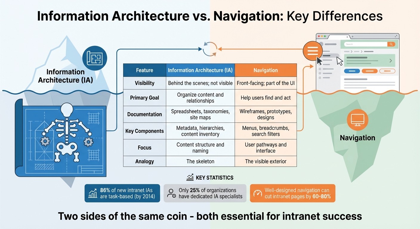
Information Architecture vs Intranet Navigation: Key Differences
Here’s what we’ve figured out at Pebb: navigation is all about what your employees see and interact with, while information architecture (IA) is the behind-the-scenes framework that makes those interactions possible. Imagine IA as the skeleton of your intranet - it’s not visible, but it shapes and supports everything your team relies on.
The confusion often comes from how closely these two work together. IA is built through tools like spreadsheets, taxonomies, and diagrams to organize content and define relationships. Navigation, on the other hand, is what users actually experience - it’s the menus, breadcrumbs, and search filters that guide them to the content. Keeping this distinction clear is the first step to ensuring both elements work in sync.
Here’s the advice we give teams: always nail down your IA before diving into navigation design. It’s tempting to jump straight into creating a flashy mega-menu, but if your IA can’t handle the depth and complexity of your content, you’ll find yourself starting over - costing both time and resources. By prioritizing IA, we make sure the foundation is strong, allowing navigation to do what it does best: guide users seamlessly. At Pebb, this approach helps us create digital workplaces where everything just clicks (literally and figuratively).
Comparison Table: Navigation vs. Information Architecture
To make these differences clearer, take a look at this breakdown:
Feature | Information Architecture (IA) | Navigation |
|---|---|---|
Visibility | Behind the scenes; not visible | Front-facing; part of the UI |
Primary Goal | Organize content and relationships | Help users find and act |
Documentation | Spreadsheets, taxonomies, site maps | Wireframes, prototypes, designs |
Key Components | Metadata, hierarchies, content inventory | Menus, breadcrumbs, search filters |
Focus | Content structure and naming | User pathways and interface |
Analogy | The skeleton | The visible exterior |
This table highlights how IA and navigation complement each other, each playing a critical role in crafting an intranet that’s both functional and user-friendly.
How Navigation and IA Work Together
At Pebb, we’ve come to realize that information architecture (IA) and navigation aren’t separate entities - they’re deeply connected. Think of IA as the backbone that organizes your content, while navigation is the face your employees interact with. One doesn’t work without the other. A well-thought-out IA sets the stage for effective navigation, and navigation brings that structure to life.
Here’s how I like to explain it: imagine an iceberg. The part above the water - the menus, breadcrumbs, and filters - is your navigation. It’s what employees see and use. But below the surface lies the massive foundation: your IA. This is where all the connections, categorizations, and content placement happen. Without a strong IA beneath the surface, your navigation would crumble. And without navigation, your IA would be invisible, no matter how well-planned it is.
A great example of this synergy comes from the Scottish Government’s intranet, "Saltire." In 2024, they made a bold move by shifting from a department-based content structure to a task-based IA. Instead of organizing information by internal functions, they focused on what employees actually needed to do. Using tools like card sorting and tree testing, they created a "My Workplace" section that grouped key tasks together. The results were stunning: Saltire ranked in the top three out of 15 intranets studied for task completion rates and speed. Their success wasn’t just about having solid IA or smooth navigation - it was about both working in harmony.
This approach resonates with what we do at Pebb every day. Take our Knowledge Library or Apps Wall, for instance. We always start with IA, mapping out how information connects and what tasks employees need to complete. Then we design navigation that makes those pathways crystal clear. The goal is simple: let employees move through the system effortlessly, without even thinking about it.
At the end of the day, IA is all about creating a logical framework for findability. Navigation, on the other hand, is the tool that helps employees access that framework. They’re like two sides of the same coin - you can’t have one without the other if you want an intranet that truly works for your team.
How to Balance Navigation and IA
Balancing navigation and information architecture (IA) is all about focusing on employees and how they actually work. At Pebb, we’ve discovered that the best intranets don’t start with departments or hierarchy - they start with real people and the tasks they need to accomplish. Everything else flows from there.
Start with User-Centered Design
Here’s a common trap: designing an intranet based on how your organization is structured rather than how employees actually use it. It’s an easy mistake to make, but there’s a better way - bring employees into the process from the start. For instance, open card sorting lets employees organize content in ways that feel intuitive to them. Then, you can use tree testing to validate whether those groupings actually work. Tree testing is a simple, text-only method where employees try to locate specific information, like a safety manual, without being influenced by visuals.
A great example of this approach is the Scottish Government’s intranet redesign. By using open card sorting and tree testing, they created a "My Workplace" section that prioritized employee tasks. The result? Their intranet, Saltire, ranked in the top three for task completion.
Now, here’s something that might surprise you: only 25% of organizations have someone fully dedicated to intranet IA. If that’s not an option for your team, you can still get it right by involving employees through surveys and usability tests. Trust me, this is way better than ending up with a navigation system that only makes sense to your IT department.
Once you’ve nailed the user-centered design, it’s time to think about how your intranet performs on mobile.
Design for Mobile-First Teams
For frontline workers, mobile functionality isn’t just nice to have - it’s essential. Studies show that employees using intranets with centralized content management complete tasks in an average of 78 seconds. Compare that to 123 seconds on distributed models, and you’ve got a 45-second difference that can be critical for someone on a factory floor trying to find a form or check their schedule.
At Pebb, we’ve built our all-in-one employee app with mobile-first teams in mind. Here’s how we did it:
Flat, task-based structure: Our Knowledge Library makes it easy for frontline workers to find what they need without wading through endless menus.
Prominent search: Our integrated search bar is front and center, delivering instant results.
Apps Wall: One-tap access to tools like shift schedules, PTO requests, tasks, calendar events, and digital forms makes life simpler.
We’re not the only ones seeing success with this approach. Atrium Health, for example, uses a type-ahead search feature that suggests terms and links directly to pages, saving users from dealing with a separate search results page. Similarly, the Northern Alberta Institute of Technology revamped their transit-discounts page with bulleted lists instead of dense paragraphs, making it much easier to scan.
Here’s the secret to making mobile work: design for scannability. Use large fonts, high contrast, clear headlines, and bulleted lists. Skip the mega-menus - they’re a hassle on small screens. And make sure your search bar and key navigation elements are always visible. These small tweaks can make a huge difference.
When you strike the right balance between strong IA and mobile-friendly navigation, you’re not just creating an intranet - you’re building a tool that genuinely helps people get their work done. That’s the kind of impact we’re all striving for.
Conclusion
Intranet navigation and information architecture are like two sides of the same coin - inseparable and equally important. Think of IA as the blueprint that organizes your content, while navigation is the user-friendly map that guides employees to exactly what they need. When these two work together seamlessly, you create a digital workspace that boosts productivity and reduces frustration.
Here’s a reality check: nearly 47% of employees say their company’s intranet is difficult to use. That’s almost half of your team struggling with a tool meant to simplify their workday. Often, the issue lies in one of two places: a weak IA that fails to organize content effectively or navigation so complex it leaves users lost.
At Pebb, we tackle this head-on with our all-in-one employee app for communication and operations. Our flat, task-based structure keeps the IA steady - even through company reorganizations. Pair that with our mobile-first navigation, and frontline workers can locate what they need in seconds, not minutes. Features like the Knowledge Library, prominent search tools, and an intuitive Apps Wall make sure employees don’t see the complexity behind the scenes. Everything is built with their needs and mobility in mind, ensuring accessibility no matter where they work.
And here’s the kicker: you don’t need a dedicated IA expert to get this right (only 25% of organizations have one anyway). Start by focusing on what your employees actually need, test early and often, and choose a platform that balances structure with usability. When IA and navigation work hand in hand, your team can stay connected, work smarter, and focus on what really matters.
FAQs
How does a strong information architecture make intranet navigation easier?
Think of information architecture (IA) as the backbone of your intranet. It’s the behind-the-scenes magic that organizes content so navigating through your intranet feels natural and frustration-free. While navigation is what your team interacts with on the surface, IA is what ensures everything is grouped, labeled, and structured in a way that just makes sense.
Here’s the deal: a well-thought-out IA makes life easier for everyone. It organizes content in a logical way, so employees can predict where to find what they need without a scavenger hunt. Labels are written in clear, everyday language - no jargon, no guessing games - so clicking around feels intuitive. And let’s not forget consistent navigation patterns like breadcrumbs and quick links, which save time and help employees focus on getting things done instead of getting lost.
At Pebb, we’ve baked these principles right into our platform. Whether you’re scrolling through the news feed, searching the employee directory, or tackling your to-do list, everything is designed with straightforward, task-focused pathways. And here’s the kicker: you can get all of this with our free plan for up to 15 employees or upgrade to our premium plan for just $4/user/month. It’s an all-in-one solution that makes intranet navigation something your team won’t even have to think about - it just works.
Why is organizing an intranet by tasks better than by departments?
From my experience, structuring an intranet around tasks rather than departments is a game-changer for employees. When the navigation mirrors what people need to do - like "submit an expense report" or "review my benefits" - everything becomes quicker and more intuitive. It eliminates that frustrating moment of, "Wait, which department handles this?"
What’s even better is that a task-based design stays relevant no matter how much your organization evolves. Departments might shift, merge, or rebrand, but tasks like "choose a healthcare plan" or "file for reimbursement" are constants. This setup cuts down on confusion, saves time, and ensures your intranet remains useful in the long run.
At Pebb, we’re all about making communication, collaboration, and operations as seamless as possible. That’s why we’ve baked this user-first approach into our platform. Whether someone’s working on the frontlines or behind a desk, we make sure they can access exactly what they need - no headaches, no guesswork.
Why is a mobile-first approach essential for frontline teams?
Designing with a mobile-first mindset isn’t just a trend - it’s practically a necessity for frontline teams. Think about it: these folks are already using smartphones and tablets daily, so why not tailor their tools to fit seamlessly into that workflow? By focusing on mobile-first design, we cut through the clutter. Navigation becomes a breeze, whether someone’s checking updates, reviewing schedules, or receiving safety alerts. No more hunting through endless menus - just tap, and you’re there. It’s all about keeping employees connected and in the loop, whether they’re on the shop floor, in a warehouse, or making deliveries.
At Pebb, we’ve gone all-in on this approach. Our all-in-one employee app is fully optimized for both iOS and Android, so frontline workers can handle everything right from their phones. Need to clock in? Done. Want to check your shift, manage tasks, view events, or complete a digital form? Easy. Got an update to share or an incident to report? It’s all right there, in the palm of your hand. And here’s the kicker: Pebb offers a free all-in-one solution for up to 15 employees, or you can upgrade to our premium plan for just $4/user/month. It’s a game-changer for keeping teams agile, informed, and ready to tackle whatever comes their way.
